Sunday 11 April 2010

The final tasks

The three products in this post do not have any analyses or annotations. For the video's analysis click here, for the Digipak's analysis click here, and for the website homepage analysis click here.


The Music Video


The Digipack


The website
(follow this link to view full website - http://jfs10236mediawebsites.org/JaredPhilippo5209/index.htm)

Monday 29 March 2010

Task 4 (Part 2/2) - How did you use new media technologies in the construction and research, planning and evaluation stages? (Hardware)

As said in the previous post, we are very fortunate to go to a school whereby we have this expensive and very useful equipment and software to use 'at our finger tips'. It is very hard to find someone that has all the relevant equipment such as camera, dolly aswell as the very advanced editing suite. Below are a list of hardware that was used throughout the creation of the music video and the reasoning behind them.

1. DV Tape: Many cameras nowadays are filmed using memory cards however we had a more advanced camera which needed to use a DV tape in order to capture the footage. This would be inserted in the camera and would then when the user would want to capture the footage, they would need to insert it into the capturing device and transfer the anolog signals into a digital format.

2. Canon DM-XL2: We were given a Canon DM-XL2 to film our scenes with. Luckily in last years media project, we had to use the same camera so I mostly knew what every button did and how to overall use the camera. This did come with flaws though as the camera was very large and had to be kept in a large box to be looked after which whilst transporting to the different locations was very hard as it was extremely heavy.

3. Tripod connector: The tripod connector which can be seen in the below shows is the piece of equipment which attaches itself to the camera in order to be plaed on a tripod. This would ensure that it would be steady and not fall off the tripod which could damage the camera itself. The plate would slide itself into the located position on the camera and would then screw itself onto the tripod. It was very difficult at first to grasp how the connected fitted on however once we got used to taking it on and off, it fit on perfectly.


4. Tripod: The tripod itself is pretty self explanatory. It has three legs which can be fitted onto a dolly. The camera is fitted onto the connected which is then placed onto the top of the tripod. The tripod allows the user to film shots in a straight frame by fixing its legs on the surface. wheels. The height can be adjusted and to ensure that the camera is at a straight angle, the spirit-level on the tripod which tells the user if the camera is at a fixed position or not so when looking back at the footage, the overall view is not wonky. The image below shows the tripod in full frame.

5. Dolly: Once the camera is fixed on the tripod, the tripod can then be placed on the dolly which allows the camera to move along the surface. As stated before, this means that the user doesn't need to walk with the camera and instead has a fixed clear shot. The tripods legs would fit into the rubber sections of the dolly and would be securely fit so they cant come out of place. The only problem with using the dolly was that when we were filming on the gravel, the camera would shake a lot as it wasnt a straight surface. This could be seen in the music video when it is very shaky.


6. Capturing machine: When we had finished filming we would then need to capture the footage. This was achieved by placing the DV tape into the capturing machine, locating the capturing device via Adobe Premiere Pro and then locating the selected footage. We would need to reverse the tape and then click play and record which would then capture the requried footage and store it onto the hardrive in a digital format. This is an example of how we co ordinated software aswell as hardware throughout our music video.

Task 4 (Part 1/2) - How did you use new media technologies in the construction and research, planning and evaluation stages? (Software)

I am very fortunate to have be aware of all the new media technologies that are available to me as they have helped me not only develop my music video but let me allowed the website homepage, music video, blog aswell as the digipak covers to not onyl be created but also allow me to include certain aspects and elements that would have been impossible otherwise. Below is a list of software and websites I used whilst creating my music video and the reasons behind them.

1. Bing: The seach engine website 'Bing' was used as the main search engine throughout this project. I chose this opposed to google as I feel Bing really narrows down the search for me opposed to google where it comes up with thousands of searches most of which are irrelevant. It rarely let me down as I usually found the websites, images or information that I needed.

2. Youtube: The video upload website ' Youtube' allowed me to find the necessary videos that I needed in order to complete certain tasks such as in the beginning of the project, before Francesca or I had chosen our track, we were able to listen to various other songs found on youtube in order to make the decision. Youtube also had an embedding feature which allowed me to post up the video aswell as customise the video in terms of colour and annotations so the audience reading my blog can get the full required information needed.


3. Photoshop CS2: This programme allowed me to compose and edit graphics not only used for the website but also for the blog when I needed to annotate a photograph etc. I preferred to use photoshop opposed to Coral Photo paint as I feel Photoshop comes with more features and is much more professional as most graphic designers choose to use this software.

4. Blogspot: The website 'Blogspot' was used so we could document all of our planning, researching and creations so that not only the examiner could read up on them but also myself to know where we are in the project timeline. This was obviously the main website as this is what we used to present our coursework however could of used alternatives such as wordpress aswell.


5. Facebook: Facebook was used to not only contact Stenchman to get the rights for the track but also to organise all the actors to come for the filming. Without facebook there wouldn't of been any other way to get in direct contact with Stenchman however we would of been able to contact his record label and ask for the permissions for the track.

6. Adobe Premiere Pro: Adobe Premiere Pro was the software used not only to capture the footage but also to edit it and to overall create the music video. Included with Adobe Premiere pro enables, the user is given a range of different editing features such as the blur tool which was discussed earlier and the cutting and razor tool. With this advanced piece of technology, we could cut up all the relevant shots and re-arrange them in order so the user can view the music video properly. It also allowed us to import the soundtrack and include titles which again are also very important and required for the music video.


7. Dreamweaver: Dreamweaver was used when it came to creating our website homepage. Dreamweaver was beneficial when creating the website homepage as it allowed the user, myself, to import images onto the canvas to work with. It also gave me the option to add text, change its font and colour. My knowledge with dreamweaver is pretty advanced and so I knew the basics on how to create a website. I chose dreamweaver opposed to Fireworks as you can edit HTML with dreamweaver and it is much more flexible with its functions. Its overall outcome of a completed website with dreameaver looks much more professional


Task 3 - What have you learned from your audience feedback?

Audience feedback was vital for us as the producer/director to gain feedback to idea the audience have as after tall we are making the music video for them and if there is a large majority of people that dislike a certain area to the music video, we must change it.

My partner and I would share ideas with our friends and teachers to gather their thoughts on them as they could have other ideas that we might of not thought about. A way of gathering ideas and thoughts from third parties, we carried out some questionnaires asking them their thoughts on developments we might have or their view on different types of music videos as a whole. We would then analyse our results and make clear judgments to whether would should continue pursuing on a certain idea or not. An example of an idea that my partner and I had was the argument between a boy and a girl in the beginning whereby the camera would be from the point of each of each of them. The image below is an image of this idea:


This opening scene was inspired by the film 'cashback' - you can view more information on this here.

After producing a first draft of a storyboard, we showed it to our teacher however she was not impressed with what we had produced. We wanted to use the filming techniques used in Professor Green's video - Upper Clapton Dance. More about this video can be viewed here.

We wanted it so that the camera would be filming at a head angle and would be focusing on the characters face. This however did not include a variety of shots which is what our teacher had told us to do. We had to scrap that idea and start working on a new storyboard. We had proposed to do a questionnaire whereby we would hand it out to people who would be in our target market - more about this questionnaire can be found here.

After analysing the results of the audience feedback we came up with a new idea for the video. We decided that we would use the concept of having individual characters however each of their lives which link to everyone elses in some ways. We also wanted to use the theme of loneliness and depression which relates to the music track we had chosen.

We were also going to use the original idea we had whereby the boy and girl would be having an argument. From the audience feedback on the idea, we decided that we will also have them in black and white and the girl would slap him just like in the film cashback. You can see below how we implemented this idea into our music video:


Aswell as producing a music video, we also needed to produce a digipack which consisted of a website and an album cover. I gathered research before hand which can be viewed here.

This involved me looking at various album covers some related to the genre dubstep, others which are just creative and original. From there we then started to draw up some ideas for our website and covers, more information about this can be viewed here.

In relation to the website homepage, I had to wait to receive the results and answers from the digipack questionnaires I handed out. The website homepage however did not need to be similar to the album cover as we wanted each piece to be original in their own ways however if I implemented similar links between the two such as colour, it would make it easier for our audience to gain a strong and obvious connection between the two.

After getting the results and analysing them carefully, I could then start to add any adjustments to the digipack covers which might be appropriate. Follow this link which shows the 4 digipack covers that were shown to the people who took the questionnaire and the reasoning behind it. The feedback I received were all very positive. They all took on board my humour and logistics behind the covers and were overall very pleased with them. This then gave me an incentive onto how I would create the website.

After creating the digipack covers I moved onto the website creation. As Stenchman (our artist) sound is described as very dark and eary, I wanted the website to be very minimal so I made the background black. I also included an image of a bride who seems to be upset. I editied it so that everything around her was blurred except her face. I wanted to include this image as even though is seems very irrelevant its overal purpose was to show loneliness and depression however I feel I should of included an image of the front of the album cover.

After asking for ideas from a range of people, they stated I should include reviews into the page so I found relevant sources such as Rinse FM and the Guardian who represent dubstep very well to have a mock review of the track.

Lastly I included a short biography about Stenchman however the colours that I chose are those which can be identified with the rastafarian culture. This is because dubstep is actually a derived sound which actully links to dub which is a genre formed in Jamaica in the 80s. I felt that these colours are very bold and anyone viewing them would understand the reasoning behind them. You can view my website here.

The last bit of audience feedback I recieved was from the post production questionaire I handed out at the music video viewing - more about this can be viewed here.

This questionaire wasn't so much about how we could change the music video but more an overall perspective on it from the audience. We were very interested with what they would have to say and it would help us know where the flaws were in the music video and how we could improve.

In a case like mentioned above, it was vital that I got these results from the audience feedback otherwise I would have not have been able to create the website homepage. Audience feedback is very beneficial as it allows the producer and creator of the product to understand what their audience wants to see, hear and watch.

Task 2 - How effective is the combination of your main product and ancillary texts?

The main product for this project was the music video itself, yet the ancillary texts also needed to be created. These were the Digipack Covers and the Website Homepage. The image below shows the connections and links between each product made and proves the importance and necessity of including all 3 pieces of work. Please click here to view the text in a larger format:
Image and video hosting by TinyPic


Saturday 20 March 2010

Task 1 - In What ways does your media product use, develop or challenge forms and conventions of real media products?

The image below shows 6 screen shots from the music video Francesca and I created. Each screen shot represents the specific frame that uses, develops or challenges the forms and conventions of real media products (the 'real media products' being music videos).


1 - This first image challenges the forms and conventions of real media products as it is not common to find a women hitting a man in a video. In many videos such as in Hip Hop, it is usually the women who is causing wrong from either being caught cheating or the girl is a 'gold digger' and only in the relationship for money. This is in contrast from our video as it is now the man who is in the wrong and is actually getting punished for it by getting slapped by the women. This is also uncommon in music videos as it is usually found that the girl takes back the wrongful boyfriend after he apologies however in our music video, this isnt the case.

2 - In this scene we see the boy giving money to a tramp. This uses the forms and conventions of real media products as most videos are 'politically correct' whereby they don't show any discimination for anyone who is disadvantaged. This is usually because they don't want to show the artist in a bad light in the media however in real life, I am sure that most people would walk past a beggar without giving them any money.

3 - In this scene, we see the group of teenagers taunting the beggar and someone walking by without intervening. This challanges the forms and conventions of real media products as society tries to promote 'togetherness' and the 'all as one' theory whereby everyone should help each other out however in todays society, most people stick to themselves and don't usually intervene as they are scared to get hurt themselves. In this case, the man walking past sees what is going on however chooses to ignore it as he is either worried on getting hurt or that he feels the tramp doesn't 'deserve' to be helped out. In most media products, their is a common basis that they try and establish the morally corect codes that are given out from the elites such as the government.

These codes are that we must all help each other and that everyone is the same however this is questioned as all advertisers create a marginalisation between the rich and poor by selling products that only rich people can afford. This creates a sense of isolation for the poor which we try and portray in this scene where the teenagers are wearing fashionable clothes and they have their expensive mobile phones however the tramp has nothing and is begging. It also contrasts with the age difference where the younger people actually have more material wealth then the older person which isnt usually common in todays society.


4 - In this scene, we see the two girls who seem to be dressed very seductivly even though we can see its a cold day as all the characters are dressed warmly. This develops the forms and conventions of real media products as in most videos the girls are 'sexed out' as they are wearing clothes which show off the skin. We wanted to play around with this idea of branding girls as sluts and tried to add humour to it as we found that they don't actually fit within the conventions of the music video as it is all about lonelyness and isolation however their image shows happyness and 'freedom' in a way. However the hidden message behind these characters are that they are not actually free, they are conforming to their apparent given image of being sluts which has been developed overtime within society. This means they must please the man by showing off their skin and acting in a flirtacious way.


5- This scene shows the girl being abandoned by the boys as they find the other girls attractive and easy. This challanges the forms and conventions of real life media products as in most music videos it is the guy trying to attract the girl and then getting abondened by the girl as they have found other men who usually appear to have large muscles etc. In this case however, we wanted to reverse that convention and wanted to use the pre-scripted idea that all men want is sex. In this scene we showed that however we wanted to show that the two girls actually had the power whereby all they had to do was sit on the bench and they would just wait for the guys to come 'strolling' in.


6 - The last scene we have everyone on the couch drinking alcohol. This uses the forms and conventions of real life media products as in most cases, alcohol eases the environment and usually acts as a hidden factor within the socialising of the two sexes. In most cases such as in clubs, both sexes must have some sort of alcohol for them to comfortably socialise. We wanted to play on this idea however we wanted to show they must have alcohol to socialise in a small living room which adds humour to the music video however it is in contrast to what people say where it is was much easier to socialise with others when you were younger.

Editing the music video

Transitions:

A 'Transition' is the movement or change of each of the individual scenes and shots within the music video. One example of a transition is the 'Fade' transition. These were numerously used throughout the video. Please see the list below that shows when a 'Fade' transition was selected to occur in the music video:

- In the beginning of the music video in the argument scene between the boyfriend and girlfriend.

- The scene where chloe is looking on at the boys abandoning her and moving towards the girls

- When the group of teenagers walk out of shot and the cross over from the park to the living room.

The next transition I used was that I cut the scene where the tramp was leaving his position on the street and walked out of shot. I cut this scene into little segments and with each segment I cropped to make the left side of the tramp turn black and in a sense 'walk with him' as he leaves his 'area'. The wipe is called a 'Bar Wipe' which moves from left to right. An example can be seen below:
Image and video hosting by TinyPic

The next transition I used was the 'Dissolve' transition which was selected to distort the movement of the four characters leaving the bench walking past the camera. The interesting thing about this shot was that any transition we used on the shot, the footage would automatically change each time into distorting the overall footage. This worked in our favour as it produced various effects that even we couldn't apply. The colours that were created are vibrant which adds to the feeling of being drunk which the teenagers were feeling. Below you can view the tool that we used which was present in the effects area in Adobe Premiere Pro.


Another tool we used was the razor tool (not in the 'Effects' tab) whiched allowed us to slice up any piece of footage. This helped us cut each shots to apply the effects to them or just simply remove any unwanted shots such as bloopers etc.

This cutting technique was used throughout the music video and can sometimes be seen as very noticeable such as when the boyfriend is walking to the tramp he is moving backwards and forwards in time with the music. Quick cuts were also used to represent the anger and momentum of the argument.

An example of this technique being implemented is the scene of the beggar lying on the street. The music present here is very loud and bass heavy. We decided to place the tramp in this scene as we feel it represents the tramps messy and distorted life which the music mirrors.

The simple razor tool was also used to cut shots to be placed exactly in time with the beat of the music. This can be found when the teenagers are walking away from the tramp and coming towards the camera. The camera focuses on their legs and feet. Each of their steps are in time with the drums of the soundstrack. Another good example of a great cut and in time with the music, is when the lyrics say, "No, its the saddest experience you'll ever know". The camera immediately cuts to Chloe's angry yet and bewildered face, just as the singer says, "No". We feel this shot is excellently executed as it was just spontanious that she was to say that and we are lucky we found that footage and we thought on our feet as we feel it definitly made the music video much more powerful to the audience.

Effects:
An 'Effect' is a alteration to an original clip to distort the image in some way. Examples of some effects are the change in contrast, brightness, saturation, focus and blur. Effects are useful when it comes to editing a music video, as the user can alter or change footage which they could not do when filming for example, the majority of the the music video is displayed in black and white however, when we captured the footage, we did not film in black and white however we used the black and white tool available in Adobe Premiere Pro to change the overall look of the clips. This made the tramp look more depressed and the abandoned girl feel more isolated from her group.

The black and white effect used in the music video represents the miserable and desolate attitudes of being lonely. We also used colour to shots to represent happiness and even though it was short cuts of colours, this showed that the homeless man gained a sense of joy when drinking alcohol. When the beggar is given money from the little girl, the scene flickers some colour to show that even though he is getting money, it will not solve all his problems.

Adobe Premiere also gives the user an opportunity to 'blur or sharpen' parts of your video. As the majority of our video was shot in a focused and clear way, we added the blur effect to distort some of the clips to represent confusion which many of the characters felt. Please see the list below of occasions where the 'Blur' effect was used:

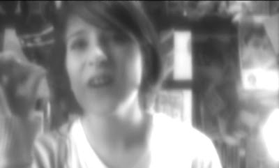
- In the beginning of the music video, we can see the girlfriend shouting at the boyfriend. The blurred tool was used to show that her mind is confused and blurred. Please see below a still image of the video showing the blurred shot:

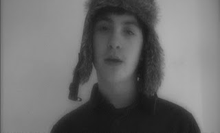
We wanted to then represent the boyfriend as more clear minded as he is arguing and defending himself. This is similar to real life as it is always argued that the boy is always right and the girl is always wrong. We wanted to represent this analogy in our music video. However, as the argument progresses, the girlfriends face becomes less blurred as it is supposed to show that she is becoming more clear minded and composes herself enough to slap the boyfriend. Please see the image below which shows the boyfriends face:
Image and video hosting by TinyPic


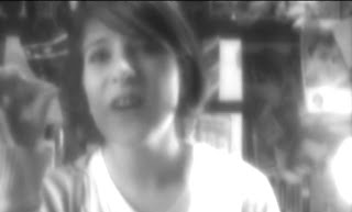
The next shot we blurred was when we showed the point of view of the tramp being harrased by the teenagers who are laughing and taking photographs of him. This shot was blurred to mirror the confused and delirious mind of the beggar; since he probably does not eat much and had been drinking some alcohol, we wanted to show his troubled state and how vulnerable he is. Please see the blurred still image from the video below:


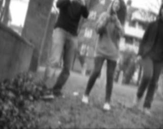
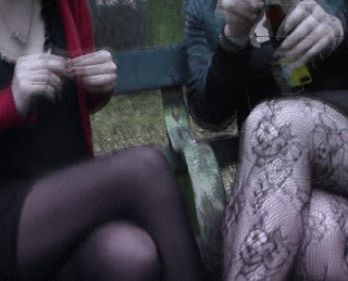
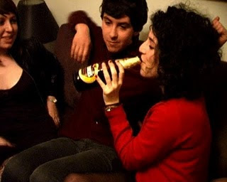
The next shot we then blurred was the scene where the camera pans up from the floor showing the bodies of the two girls. This was supposed to show their mysteriousness and the sexual orientation of these new characters. A blur effect was added to hide their real image as we wanted our audience to use their imagination to define these girls. As the viewer later sees, they are also drinking alcohol. The blurred effect represents the distorted and confused sensation and sight that the two girls may be experiencing after drinking the cider. The image below shows the two girls legs:
Image and video hosting by TinyPic


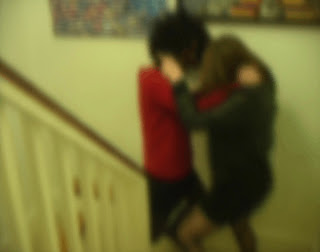
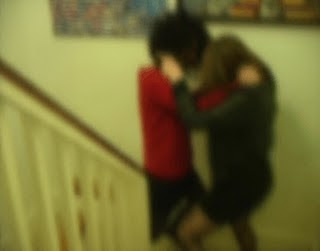
Another increased blur is used as the two girls fight on the staircase this is done to emphasise their minds as they are blurred from the alcohol and their emotions and the anger they both have due to the amount of alcohol they have consumed. Please see the still image from the video below:


Another effect can be chosen called the 'Ghosting effect'. It is used in our music video when the boyfriend is being slapped by the girlfriend early on in the music video. According to Adobe the ghosting effect 'Overlays transparencies of the immediately preceding frames on the current frame.' My view on this tool is that it duplicates the clip and then adds blur and distortion to it so both clips are overlayed and gives the appearance that there is some sort of 'ghost' like feature. This effect was not used that much as it adds a sense of falseness which we didn't want our audience who were viewing our music video to think. We only used to to emphasise the anger that the girlfriend had when slapping the boyfriend. The still image below shows the girlfriend (Jess) slapping the boyfriend (Joseph).


Aswell as blurring the shot of the two girls, we also used the 'Ghosting effect' on the shot. We used this effect to represent their hazey minds as they are opening and drinking the alcohol. The ghosting effect creates the sense that they cannot control themselves and they are vulnerable. Please see the screenshot from the music video below:


We edit the Contrast of numerous shots throughout the music video. This was done by locating the 'Effects tab' and selecting the 'Image Control' option. Here we were able to change the Brightness, Contrast Hue and Saturation. Please see a screenshot of the 'Image Control' window below:


The contrast was increased with the homeless man to emphasise and show the user the current state he was in. There was a striking difference between the dark clothes he was wearing and the brightness outside which shadowed his depression and loneliness.

Slow motion was another technique that was used during the editing process of the music video. When the frame or clip speed/duration is slowed down it emphasises the movements being created and this is then reflected by either showing the characters facial emotions or the physical movements that they are acting out.This allows the audience to see the full effect of the scene without it being rushed.

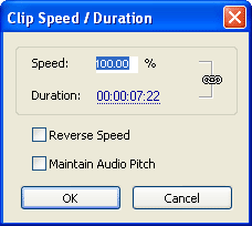
The normal speed of a clip in the frame is set at '100% speed' however when we would want to slow down the clip, we would lower the percentage.This was achieved by by right-clicking on the frame in the timeline and selecting the 'Speed/Duration' tab. The screenshot below shows the clip at 100% speed (normal speed), if the user would want to slow the speed down and extend the duration, they would change the speed to 50%.


An example of this effect being used when when Jess (the girlfriend) looks away from the camera as the boyfriend leaves the room. We extended the duration of the shot by slowing the clip down. We can see that she has lost all her anger and is now feeling very upset, we hoped that the audience would sympathize with her with this shot.


Aswell as reducing the speed of a clip we can also increase the sped and lower the duration. This is achieved again by selecting the 'Speed/Duration' tab, but instead of reducing the percentage speed, the user increases it. As said before, the original clip is set at 100% speed but we want to increase the speed to make it faster so we have to insert any percentage over 100% To double the speed and make two times as fast, 200% is selected.

Again, by using the 'Speed/Duration' tab, the user can also reverse the clip. This can be seen when the boyfriend is walking on the pathroad and whilst intime with the the music, he goes backwards and forwards. This was to show his decision in leaving - should I just leave it or should I apologise? We can see that he decides to leave the argument as the next shot we see of him is him walking towards the tramp. The image below is a still shot from this part of the music video.


Titles:

Adobe Premiere pro gave us the option to add text to our clips. We were told that in order to make it a music video, we had to include the artists name and track title in the beginning of the music video. We achieved this by going onto the insert --> text page and created the text aswell as formating it. We used a black background and made the text white for it to stand out more.

Tuesday 16 March 2010

Problems that occured....Editing

Lip-syncing

When filming the actors lip syncing the words, we didn't realise how out of time they were. What my partner and I had to do was extend the duration of one of the shots so that it fit in with the lyrics in the song. The shot of Elliot who was one of the teenagers narrating 'one is the loneliest number' was initially out of time as he didn't know the words but by extending the the clip by 67% and lining it up with the audio, we can also see that his words are in time. The screen shot below shows the shot that I am referring to of Elliot:


Continuity
The scene where the two boys and girls are inside the house and on the sofa became a small issue when editing. Abi who was the the girl who the boys found attractive originally came into the shot wearing just the dress, however midway through directing them she put on a red cardigan and we carried on filming however being unaware of the difference. At the time we didn't notice however when we started editing we became aware of it. To resolve this we had luckily found some footage of her putting on the cardigan. We cut that shot out and pasted it into a short space in between shots. Please see the screenshot below of the red cardigan scene below:


Video Quality

Francesca and I agreed that after the shot of the teenagers laughing at the tramp, the video began to go 'downhill' in not only its quality but also style. This was mostly due to the rush we were in aswell as not knowing how to direct the actors. After showing acouple of our friends the video, they said that the overall scene that bought down the music video was the shot of the two girls fighting. This was probably because it not only went on for too long but also it didn't really make much sense as the audience didn't know originally why they were fighting. We solved this by cutting the shots of Hayley looking unimpressed on the couch. We tried to emphasise the fact that she is being left out and not given enough attention. We then found another shot of everyone passing around the alcohol and not giving it to Hayley. We then put that in and showed it as that being 'the breaking point'. That is when we could show the girls fighting. This made the audience understand much more of what was going on. We also ended up shortening the fighting scene to 7 seconds and also blurred it and and cut the scene into much smaller shots, please see a screenshot of this fighting scene below:


The last problem that occurred was when the girlfriend slapped the boyfriend. We can see the boyfriend laugh when he gets slapped, this obviously shows that it is not realistic so what we had to do was, blur the clip and slow it down. This then emphasizes 'the power' of the slap' but also it distorts the boyfriends face smiling.

Wednesday 10 March 2010

Digipak Covers


We were told to create 4 images for our Digipak Covers. Please see below the 4 Digipak Covers that I have created:


The four CD covers all relate closely to the track 'The Number 1' by the artist we used called 'Stenchman'. Please see in depth analyses of each of the four covers below:
With this cover, I wanted to add contrast by having a humourous image which differs from the underlying theme of loneliness within the music video. I constructed the image myself by drawing it out on Adobe Photoshop. I chose to go with the words "I am more depressed than a sad steak" as the sentence itself doesn't make any sense and adds confusion to the viewer. I then used a formal and in a way 'comic' font which gives the image a more casual look to it.

Back Cover


This cover has a completly different mood to it. Immediately the audience get a sense of loneliness as this elderly man sits on a long bench alone. This is in contrast with the music video as the characters are all young and arent afraid to show it however with this image it is almost like he doesn't want to be old and wants to be young again. He seems very afraid of his surroundings which makes the image very uncomfortable to watch.

Front Cover


Originally the image was much brighter however I edited the tone of it to make it much more darker and I shaded the corners of the top right hand corner to give the impression that he is alone in a small however never ending room. This gives the impression that is almost in 'hell' as such as he is staring into a wall which could relate to his life which passes him by. By reducing the saturation, a depressing and glum appearance is shown through themelancholy shades and tones of grey and black.

The first cover lacks emotion or human interaction, yet this image creates feelings from the audience towards the character displayed in the photograph. This image allows the audience, or consumer, to understand how certain people feel when they are lonely. This photograph was used to make the audience sympathise with this character. It prepares them for the music video and track, as Stenchman intended to show lonely people.


The text format I used was Times New Roman. The original text was black and I duplicated the layer and made it black and adjusted the positioning slightly to give the white backdrop a more powerful outlay. I did the same with 'the number one'. I feel this made both texts very powerful to the viewer.

Inside 1

With this cover, the audience is presented with a cluster, or collection, of wor

ds. They are all synonyms for the word 'Lonely', and the word 'lonely' was chosen as it relates to the lyrics in Stenchman's track as the singer sings, "One is the loneliest number". This image is extremely ironic as even though the important word is 'lonely', none of these words appear to be 'lonely', 'secluded' or 'isolated' on the page as they are there all together.

Inside 2


The red and blue colours on Stenchmans face clash with each other as each represent a state of mind. The blue represents a more calm and peaceful mood and the red represents a more dangerous and wicked mood. As we can see Stenchman is behind bars. This adds to the theme of the music video of isolation and alienation.

I edited the background and made it black, this makes Stenchmans presence more emphasised however it shows that he is alone which again relates back to the music video whereby each character is alone and by themselves. This allows the audience to understand his unique style, personality, and sense of humour.


The metal bars also portrays him as a rebellious person, and attracts the audience to find out why he is like this, or in some cases for the audience to associate and interpellate with him. The frightening mask also adds to this rebellious behaviour as the artist is almost hiding from something.

I wanted to follow the design I had in the last cover whereby I took advantage of filling up the screen with words that co incide with loneliness and isolation which are the re accuring themes of the music video.

As the Digipak needed to consist of four-sides, the template below shows the design and layout which each cover needed to placed in:

This image shows where each image is going to be placed.

Wednesday 3 March 2010

Stenchmans Website

Our class spent a whole lesson today in the ICT classrooms working on our Homepages and Digipak covers. As I do ICT for Alevel, I have vast knowledge on creating websites aswell as editing images so I used a more advanced website creation software called Dreamweaver. This allowed me to create stenchmans homepage to how we wanted it to look, this was more the aesthetic approach to it. I am using Photoshop 5.0 to edit the images for the website such as the logo and various other images on the website.

I have now nearly finished my homepage for Stenchman. It includes images, buttons and text. Click on the image below to view the whole homepage or alternatively follow this link - http://i42.tinypic.com/qpq739.jpg


By making the track available to buy online via itunes, it makes it much more accesable to a larger audience who might of either not been ‘brought up in the vinyl age’ or just overall prefers digital tracks.

The colours all work very well with each other as having a black background, exemplifies the dark and twisted visuals which are present in the music video A simple font as it is was used as a jazzy and fancy font would not be suitable for this type of audience or genre of music.

Post Production Analysis

Francesca and I carried out our primary research by handing out surveys to an audience who were about to watch our AS Music Video production. After advertising it with posters around the school, 11 students arrived at the screening room to watch the video. The analysis of this questionnaire is below; there are a few questions that have not been commented on or analysed as I did not feel it was necessary to do so.

We only advertised in the sixth form building in our school as we did not want any of our audience to be younger than 16 as we feel they weren’t the right age group for the video. 5 people were aged 17, 2 were aged 16 and 4 were 18 years of age. We thought that this was the suitable age for the music video showing as they would not only appreciate the shots used but also enjoy the music more. We were pleased to discover that there were more males than females. We were not surprised that the majority of viewers were male as most people that listen and appreciate dubstep are male. The pie chart below shows the proportion to male and female:


The second question we asked was:
“What they enjoyed the most after watching the music video”
The majority of people enjoyed listening to the song and gave it 7/11. A quote we received from the questionnaire said “I enjoyed listening to the song itself, at one point I closed my eyes to listen to the song on its own”. I would definitely say dubstep has this effect on people, many people who aren't DJs buy the music and just listen to it as the sound is very unique and has a calming melody to it. Even though we wanting satisfaction from the audience watching the music video, this comment has proved that it is possible to sell this track by itself, which in the music industry would be great. Two people stated that they enjoyed the crossover from the narrative and cuts of the scenes. Similarly, one male said that the bit they enjoyed the most was, “... the accompanying story, which was quite reflective of the lyrics” and another person said that they enjoyed “... the way the video and the beat of the music complimented each other.” Both comments are similar however both show that our idea of linking the visuals to the lyrics has paid off.


The third question 3 asked the audience if there was a "certain scene that they found the most effective"
An audience member commented stating that they found, “The scene where the boys ditch the girl and talk to the other girls” as being the most effective scene. This is probably because we can see that most people can relate to this as one moment in their lives they have either been or been part of 'the third wheel' whereby a third member is always ditched or left out.

Three members of the audience sympathised with the homeless character and stated that the, “Homeless guy” was the most effective scene within the music video, another said, “The teenagers taking pictures of the tramp.” was the most effective. This shows to us that the majority of the audience have morals and that they understood the fact that their is segregation within society and that people below us should not be victimised for who they look like or their status within society. Even though this part of the video had received the most criticism as for many of the viewers, they could not understand the scene as we could not get a shot of the tramp in the bush as he was not available for the shooting so we just had to hope the viewers would use their imagination. In contrast to this shot, a female stated that the most effective scene for her was, “The scene where the boys and girls meet – the part of the music is appropriate and has poignancy.” We were glad with the results for this question as we were optimistic to what they might choose.

Question number 4 was a vital question as it asked the audience if they would consider purchasing or downloading the music track after watching the music video.

The illegal downloading of Dubstep nowadays has meant that many artists struggle making money from their music. Independent record labels try and make ways for their audience to purchase music most notably only releasing it on vinyl which luckily works out well as most people that listen to dubstep are DJs and purchasing music is a habit for them. Fortunately for us, we got more Yes answers than No. 4 people said yes, people said it was a “top tune” and one female said, “I like the song, it’s catchy.” 3 people said no, two of their answers were, “I didn’t like the song enough to buy it” and another one said that “The video was great, but I am more persuaded by the music itself”.

Without the internet especially youtube, Stenchman would of struggled to get his unreleased tracks heard as youtube acts as a platform where users can upload their music and can get their productions heard to a larger crowd. We had 4 people answer 'Unsure' to this question. One person, who obviously liked Dubstep as a genre wrote, “There is a lot of competition for space on my ipod and I don’t think this can compare to other dubstep artists”. A comment from a boy who also chose 'Unsure' said that, “I like the song, but it is not really my genre of music”. This was hard to understand as he obviously liked the song, but felt that he would not buy it because it was not his normal style or genre of music. Its a shame that people are still not branching out to new genres, they just listen to what is given to them This is quite upsetting as it shows that some people do not want to experiment with new styles or genres. Please see the pie chart below that shows the results from this question:


The fifth question asked the audience if they thoughtthe music video fit well and was appropriate to the Dubstep genre?
If the consumer was unfamiliar to the Dubstep genre then it was understandable that they would not be able to answer the question as they would struggle to know actually what a normal dubstep video looks like. We had provided the audience with a closed and open question, where they could mark down Yes, No or Unsure, and then write their reason for their choice, this would add less pressure on them to write a 'correct' answer as they could easily just choose one of the three options. The majority of people circled 'Unsure', most probably because they didnt understand the genre itself, for example, one person said, “I don’t know much about the dubstep genre, so I don’t know”, however, one person who selected Unsure said that, “Dubstep videos should be more partyish and rave-like”. Before constructing the video, Francesca and I had thought about maybe putting on a party and filming it however this wouldnt of fitted in with the pastiche of the song as the song itself is very depressing and sad and having a party would not fit in well. 5 people chose the Yes option, and agreed that it did conform to the Dubstep genre. Someone said that, “The use of black and white with little colour made it more interesting and ‘dubstep’ like”. Another person said that, “The style the video was shot in is very dubstep”.I personally disagree with these statements as they don't really make sense. The style of a video can't be 'dubstep like'. Dubstep indeed has a distinctive sound however what we make around it is completly different. I found this statements very closed minded and quite embaressing to read as I am a dubstep enthusiast and seeing someone who obviously doesnt really know what dubstep is stating that the video is 'dubstep like' pretty hard to understand.

Our seventh question asked who the audience sympathised with the most. I mostly thought that the audience would sympathies most with the rejected girl as I know alot of people have been in that sitatuation feeling abandonment and embaressment, we wanted to portray this and show them that this actually happens to alot of people, not just them. We were correct in our judgement as 8 of the 11 people who took the survey sympathised with Chloe. One of the male’s reasons was because “she gets rejected and left out”, another person said it was because “the two boys abandoned her”. One person sympathised with the female at the very beginning of the video, and two other people sympathised with the homeless man. It is easy for people in the target audience (16-18) to relate to the girl as we have all been in similar situations where we have felt left out or deserted.
Please see the pie chart below that shows the results from this question:


For the tenth and final question, we gave our audience the opportunity to give us some criticisms or comments. We got a variety of feedback. Some people did not write anything however a comment someone left was that the “tramp was too well dressed” and another criticism was that the “lip movements were out of sync with the music”. Both my partner and I knew this was an issue before hand. Our tramp was indeed very well dressed and if the audience looked closer, they could see he still had a reading festival band on - which tramp goes to reading festival? In regards to the lip syncing, I agree that it was out of sync, both my partner and I struggled to put the words in place as our actors couldnt mouth the words on time. We then got a very confused answer as a female said, “What was the message? Especially at the end”. It was good to know that someone had attempted to understand what was the message was, but it was unfortunate to discover that they did not understand in the end. Our best compliment was, “It was awesome! The isolation was really clear the beginning.” It was great to see someone appreciate our work especially that it took ages to complete!

Tuesday 2 March 2010

Video Screening

Tomorrow is Thursday 25th February and Francesca and I will be screening our final music video to an audience.

I created 3 posters that we have stuck up around the Sixth Form area of school, so hopefully we will get a lot of people coming to watch out music video. What we did with the posters is we didnt conform to the usual type of promotion by making the review positive. The posters were humerous and in some ways we used reverse physcology. By using obscene images and negative reviews, we felt that the audience would be more inclined to watch the music video. Here are the three posters we stuck up around the school:


The main purpose of the questionaire and viewing was to get some negative and positive feedback on our final product. Francesca created a questionnaire that asks the following questions:

1. Are you male or female? Please also write your age here: _____

2. After watching the music video, what did you enjoy the most? (It may have been the song itself, the characters, the actors etc.)

3. Was there a certain scene in particular that you found the most effective?

4. Would you consider buying or downloading this track after hearing it during the video? Please circle an answer and then give a reason on the lines below: Yes, No or Unsure.

5. Do you think that the music video fit well and was appropriate to the Dubstep genre? Please explain further if necessary. Yes, No or Unsure.

6. Which character do you feel you associate yourself with the most? (For example, you may want to mention appearance and personality)

7. Which character do you sympathise with the most? (Please describe what they wore or ask Jared or Francesca to help identify them at the moment)

8. Were there any shots or angles in particular that you liked the most?

9. Were there any colours or effects used that you liked in particular?

10. Finally, if you have any comments or criticisms, please note them down below: