 The four CD covers all relate closely to the track 'The Number 1' by the artist we used called 'Stenchman'. Please see in depth analyses of each of the four covers below:
With this cover, I wanted to add contrast by having a humourous image which differs from the underlying theme of loneliness within the music video. I constructed the image myself by drawing it out on Adobe Photoshop. I chose to go with the words "I am more depressed than a sad steak" as the sentence itself doesn't make any sense and adds confusion to the viewer. I then used a formal and in a way 'comic' font which gives the image a more casual look to it.

This cover has a completly different mood to it. Immediately the audience get a sense of loneliness as this elderly man sits on a long bench alone. This is in contrast with the music video as the characters are all young and arent afraid to show it however with this image it is almost like he doesn't want to be old and wants to be young again. He seems very afraid of his surroundings which makes the image very uncomfortable to watch.
Front Cover

Originally the image was much brighter however I edited the tone of it to make it much more darker and I shaded the corners of the top right hand corner to give the impression that he is alone in a small however never ending room. This gives the impression that is almost in 'hell' as such as he is staring into a wall which could relate to his life which passes him by. By reducing the saturation, a depressing and glum appearance is shown through themelancholy shades and tones of grey and black.
The first cover lacks emotion or human interaction, yet this image creates feelings from the audience towards the character displayed in the photograph. This image allows the audience, or consumer, to understand how certain people feel when they are lonely. This photograph was used to make the audience sympathise with this character. It prepares them for the music video and track, as Stenchman intended to show lonely people.
The text format I used was Times New Roman. The original text was black and I duplicated the layer and made it black and adjusted the positioning slightly to give the white backdrop a more powerful outlay. I did the same with 'the number one'. I feel this made both texts very powerful to the viewer.
Inside 1
 With this cover, the audience is presented with a cluster, or collection, of wor
The red and blue colours on Stenchmans face clash with each other as each represent a state of mind. The blue represents a more calm and peaceful mood and the red represents a more dangerous and wicked mood. As we can see Stenchman is behind bars. This adds to the theme of the music video of isolation and alienation.
I edited the background and made it black, this makes Stenchmans presence more emphasised however it shows that he is alone which again relates back to the music video whereby each character is alone and by themselves. This allows the audience to understand his unique style, personality, and sense of humour.
The metal bars also portrays him as a rebellious person, and attracts the audience to find out why he is like this, or in some cases for the audience to associate and interpellate with him. The frightening mask also adds to this rebellious behaviour as the artist is almost hiding from something.
I wanted to follow the design I had in the last cover whereby I took advantage of filling up the screen with words that co incide with loneliness and isolation which are the re accuring themes of the music video.
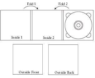
As the Digipak needed to consist of four-sides, the template below shows the design and layout which each cover needed to placed in:
